Go into any gallery or museum and see a hard-working co-star behind the scenes. It’s not the curator, docent, or even the lighting – although those are all important. This unsung hero? The wall color. These backdrops, whether soft gray, rich emerald, or serene powder blue (a color I loved at the Nelson-Atkins Museum), are like art themselves. Chosen by color experts, these paints do more than complement the art – they make it. I kept that in mind when pulling together 2023’s top paint colors.
This year, the palette is all about earthy, subtle colors. We’re seeing rich sapphire blues, muted greens, and otherworldly colors to create a calm sense. Of course, classic neutrals are part of the mix (they always are), but there’s also one surprise color in the forecast. Ready to get started? Here are the seven paint color trends of 2023, as predicted by top designers.
2023 Paint Color Trends
1. Forest Green: A Color From Nature
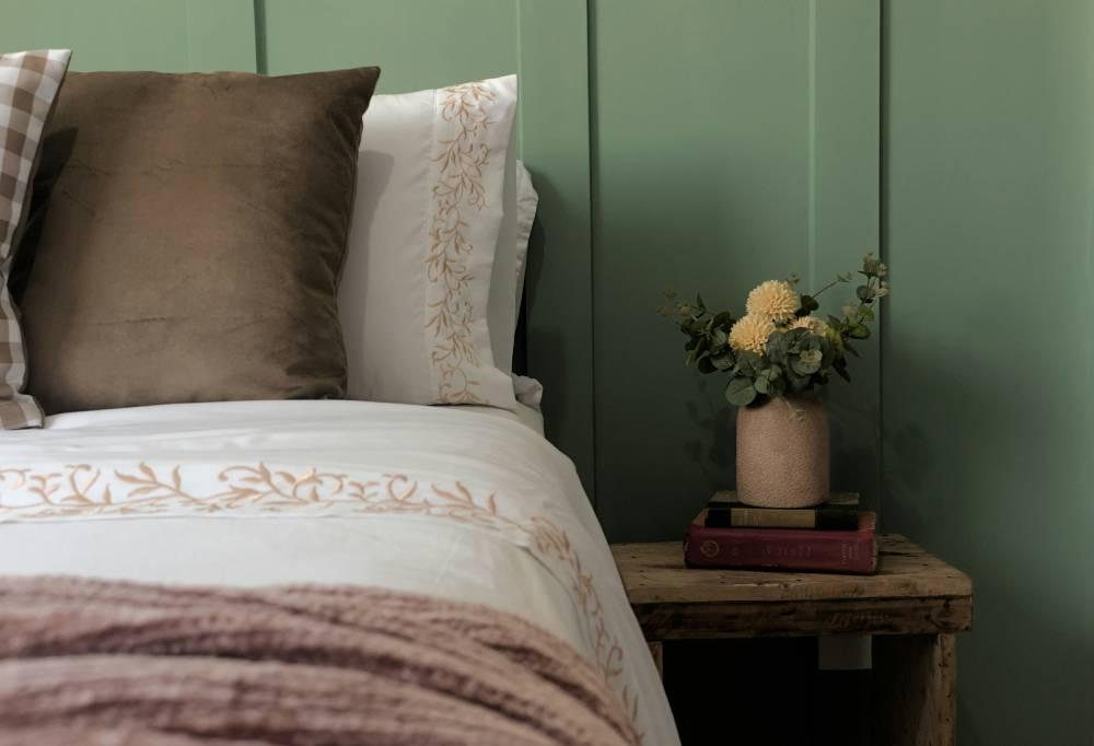
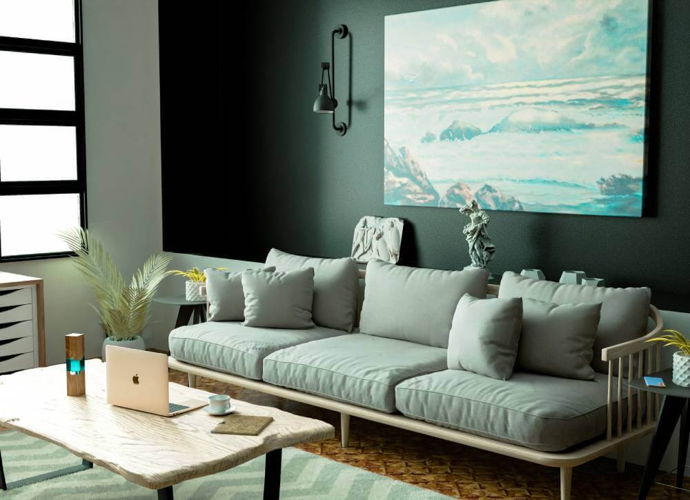
In 2023, we’ll see more forest green, a color that brings the calm of the outdoors into our homes. As Meredith Owen of Meredith Owen Interiors says, “We’ll see more earth tones in paint colors and textiles,” including rich earthy greens. Forest green is more than a color; it’s a way to ground a space and evoke the quiet strength and wisdom of nature itself. There’s something so satisfying about this color – it feels fresh and timeless and has an almost magical ability to make any space feel cozy and elegant.
Bold to Subtle
What I love most about forest green is its versatility. It’s a color that can create depth and enhance the visual dimension of a room, making a statement without overwhelming the space. As an accent wall or cabinetry, forest green becomes a focal point, adding drama and depth without overpowering the other elements in the room. This darker tone feels luxurious and grounding, making it perfect for creating a warm and cozy space, especially with natural materials like wood or metal accents, which highlight its natural root.
Where to Use It: Accent Walls and Trim
Forest green can be truly magical when used thoughtfully. Owen says, “Don’t be afraid to paint your kitchen cabinets or trim a dark green.” And I agree. For instance, painting kitchen cabinets in a forest green gives a fresh spin to an often neutral space and brings warmth to the room. Same with accent trim, where forest green adds elegance to architectural details and frames a room with a bold touch that doesn’t feel overwhelming. I love it in small spaces like powder rooms or home libraries where coziness can be amplified.
Warm Neutrals and Brass
Forest green is beautiful on its own, but the magic happens when it’s paired with other colors and materials. For a modern feel, try balancing the boldness of forest green with soft, warm neutrals like cream, blush, or light beige. The contrast between these colors creates a calm and balanced space where green can be the star of the show but still feel approachable.
I find metallic accents, especially brass, really bring out the depth of forest green. Adding brass hardware or lighting to a kitchen with green cabinets, for instance, adds elegance and sophistication. Another favorite of mine is pairing forest green with natural wood accents – this creates a connection to nature that feels organic and cozy, perfect for a living room or bedroom where you want to unwind.
2. Greige: The New Neutral for Every Room
Greige – a beautiful mix of gray and beige – is back and bigger than ever. Breegan Jane, interior designer and TV personality, sums it up perfectly: “a chalk-like color that falls between gray and beige.” Greige brings warmth and subtle depth to a room without overwhelming other design elements, creating cozy yet elegant spaces. It’s versatile enough to work anywhere but trendy in high-traffic areas like living rooms, dining rooms, and entryways. Greige is the new neutral that gives you the same flexibility as white but with warmth and elegance.
Why Greige Works: A Balance of Warm and Cool
What’s great about greige is that it balances warmth and coolness, making it a natural fit for any space. It has the versatility of beige with the sleekness of gray, so it can work with warm and cool decor. This balance creates a grounding effect that can make a room feel calm and peaceful, especially in spaces where you want to unwind. Greige also pairs well with natural materials like wood and stone, which enhances its organic feel. I think this duality makes it perfect for open-plan spaces, where it creates a flow between different areas without overwhelming the senses.
Where to Use It: Walls, Cabinets and Furniture
Greige isn’t limited to walls – its subtlety and depth make it perfect for cabinets, furniture, and even wood stains. Jane says it’s “an updated wood stain if you’re trying to get away from dark tones,” and I can see why. Greige can soften cabinetry and furniture pieces, a gentle alternative to both white and dark stains, which can feel too harsh. In kitchens, greige cabinets add timeless elegance without feeling too cold or clinical, and in living rooms, greige-painted furniture pieces blend in with any color scheme and add understated sophistication.
Every Room
Greige’s versatility really comes into play when it can be used in different rooms and for different purposes. In the living room and dining room, greige walls create a peaceful backdrop that works with bold or neutral furniture. I love greige in bedrooms and home offices, where its calming, chameleon-like qualities can create a serene space. In dining rooms, it sets the scene for elegant spaces, and in open-plan homes, it’s the perfect choice to keep the whole space feeling connected.
Pairing Greige: A Blank Canvas for Natural and Bold Accents
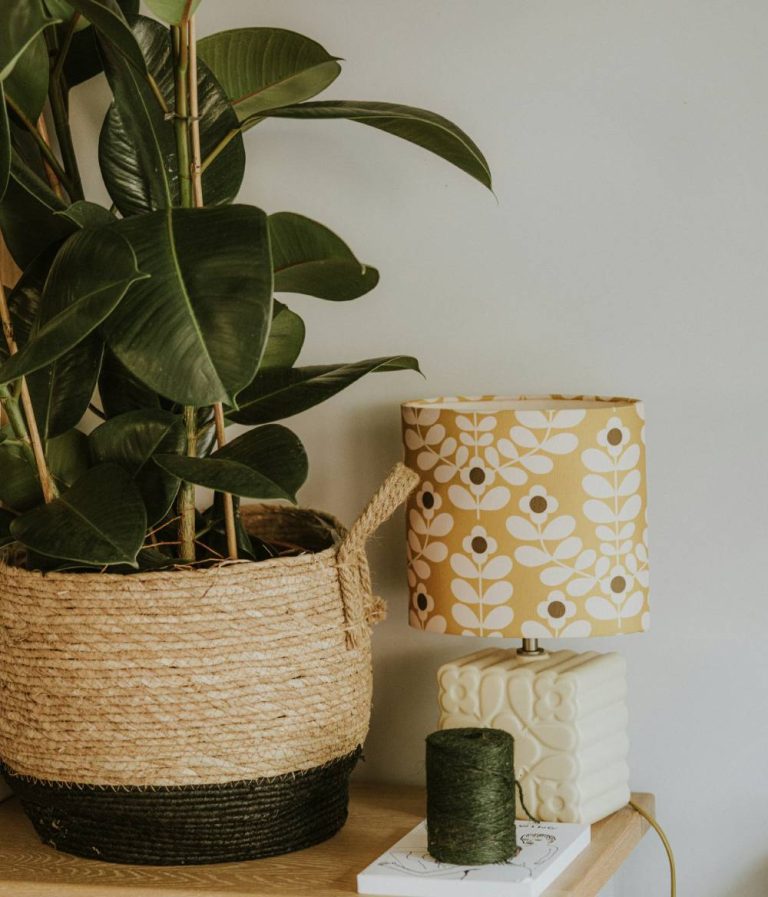
Greige is a great backdrop for both bold and natural accents, a neutral canvas that lets other colors and textures take center stage. For a soft, earthy palette, try pairing greige with soft natural tones like sage green, blush, and terracotta. These colors bring out the warmth in greige and create a balanced look. Greige also works with bold accents – rich colors like navy, emerald, and charcoal make great contrasts and create focal points without overwhelming space.
I love pairing greige with natural textures like rattan, wood, and linen. These materials bring out its organic feel and sense of coziness and connection to nature. For a modern twist, greige can also pair beautifully with metallic accents like brass or matte black and add a touch of sophistication to an otherwise calm space.
3. Dark Blue: Go Big or Go Home
For those who want to make a statement in 2023, dark blue is the color of the year. Interior designer Cristina Lehman of C. Lehman Home says to “go big” with deep blues to bring a “cool and modern look” into your space. Unlike lighter blues, which can feel serene and open, dark blue is rich, intense, and atmospheric. It’s perfect for those who want to create a sophisticated, dramatic look that’s both timeless and modern. I love how dark blue can elevate a space and make it feel luxurious and inviting without overwhelming the senses.
Dark Blue for Intimate Spaces
While dark blue can be dramatic, it’s perfect for smaller or more intimate spaces. Lehman says to use it in powder rooms, studies, and cozy family rooms, where the color can create a snug cocoon-like effect. Dark blue works well in spaces that don’t get a lot of natural light, as the color absorbs and balances the light and creates a cozy atmosphere. I find that in smaller spaces, dark blue feels like a big hug, wrapping you up in warmth and style.
Go Big with Dark Blue in the Dining Room
If you’re feeling brave, Lehman says to take dark blue into the dining room. This is an excellent idea if you want to add drama and sophistication to the space. Dark blue walls can be a beautiful backdrop for artwork, mirrors, or metallic accents and turn a dining area into a formal space perfect for dinner parties and gatherings. Paired with warm wood furniture, brass fixtures, or even rich green plants, dark blue can make any dining room feel like a scene from a classic Hollywood movie.
Pairing Dark Blue with Warm Accents
Dark blue’s cool undertone is very versatile when it comes to mixing with warmer colors. Lehman says to balance dark blue with warm-colored décor accents like rust, terracotta, or gold to prevent it from feeling too harsh. Adding warm textiles like a rust-colored throw or brass or gold-framed mirrors can add depth and interest and make the space feel balanced and dynamic. For me, this mix of cool and warm tones is the key to making dark blue spaces feel stylish and inviting—it’s all about finding that balance.
Dark Blue for Modern and Classic
Dark blue is a modern and classic color, making it versatile for many design styles. Whether your style is minimalist, traditional, or eclectic, dark blue can ground a space and add a touch of sophistication. It’s perfect if you want to create a refined space with a bit of attitude. Dark blue walls, especially in a matte finish, have an almost velvety depth that adds luxury to any room.
4. Aubergine: The Statement Colour of 2023
Whether you call it aubergine or eggplant, this gorgeous, rich purple is going to make a big impact in 2023. Designer Laura Pankonien is a big fan of using aubergine in interiors and says it adds drama and elegance to a space. The depth and complexity of aubergine can turn any area into something special. I find this color both beautiful and calming, and it’s a unique combination of sophistication that can take any room to the next level.
Powder Room Drama
One of the best uses for aubergine is in the powder room. Pankonien says this deep, luxurious color can create “a moment” when used on the vanity or accent walls. Imagine stepping into a powder room surrounded by aubergine – it’s a color that pulls you in and makes you feel like you’re in a luxury retreat. The warmth of aubergine adds coziness to a small space that often needs that extra something to feel inviting.
Contrast
When using aubergine in a powder room, contrast is key. Pair it with white or light grey fixtures, and it’ll be a beautiful balance. A white sink and mirror framed in brushed gold or silver can pop against aubergine walls, and both will shine. I think this contrast is essential – it keeps the space feeling light, not heavy and still allows for the drama of aubergine.
Aubergine with Textures and Patterns
Aubergine’s versatility goes beyond color; it can be paired with different hues, textures, and patterns. To add depth to the design, think about incorporating plush fabrics like velvet curtains or a soft bath mat in a lighter purple or cream. Aubergine pairs beautifully with natural materials; a wooden vanity or rattan accents can create a layered look that feels warm and cozy.
For the Brave
Aubergine is not for the faint of heart. It’s a bold choice that makes a statement for those who want their space to reflect them. Some may shy away from deep purples, but when done right, aubergine can be versatile and work in many styles, from modern to bohemian.
Using Aubergine Elsewhere
While the powder room is a great place for this color, aubergine can also be used in other areas of your home. Try it in a reading nook or as an accent wall in a living room. The color adds luxury and depth that can be paired with softer colors for a balanced palette. I see aubergine as the perfect background for artwork or family photos to create a curated look.
5. Muted Green: The Classic Choice for 2023
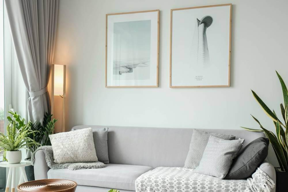
After the rise of “dusty” greens in 2022, soft greens will take over in 2023. Tanya Smith-Shiflet from Unique Kitchens & Baths says these softer, more neutral greens are a timeless choice that can work with any design style. I love soft greens; they’re a breath of fresh air. They feel calm and natural and are perfect for relaxing and unwinding spaces.
In Your Home
Soft greens are understated and calm, a backdrop without being overwhelming. This color is for those who want to create a peaceful space. I see soft green in spaces like the kitchen or mudroom where a calm atmosphere can make a big difference in our daily lives. These colors feel comforting and create a space where family and friends feel at home.
Best Use: Kitchen, Mudroom, Home Library
In the kitchen a soft green can bring life to cabinetry or accent walls, a nice alternative to the usual whites and greys we see. Painting the ceiling in a soft green can enhance the overall aesthetic and create a cohesive look. Imagine a soft green kitchen island with warm wood accents – it’s a beautiful combination that feels modern and cozy.
For the mudroom, which is often the entry point to our homes, muted greens can bring a sense of grounding. They create a welcoming feel, perfect for shaking off the outside world as you step into your haven. Add hooks, baskets, and other natural textures to enhance this earthy feel.
In a home library, muted green can create a calming atmosphere for reading and relaxation. Imagine bookshelves painted in a soft green against a cream or white background – a peaceful space to quiet the mind and spark creativity.
Muted Green with Other Colours
What’s great about muted green is that it works with so many color combinations. It pairs well with soft neutrals, whites, and even deeper colors like navy or aubergine. I like the idea of combining muted green with rich wood tones for furniture or flooring—a warm and cozy space that feels natural and earthy. For accents, try warm metals like brass or gold to add to the muted green without overpowering it.
Contrast and Visual Interest
To add depth and visual interest to a space with muted green, try using darker or bolder colors as accents. This could be throw pillows, artwork, or even a bold light fixture. The contrast will enhance the calming effect of the muted green and add layers to your design. I think this combination of colors creates a space that feels intentional and easy.
Beyond its looks, muted green has a psychological impact that’s good for our well-being. It’s known for its calming properties, which can help reduce stress and anxiety—something we all need more of in our busy lives. So, it’s a great choice for spaces where relaxation is a top priority—bedrooms or reading nooks.
A Colour for Every Season
What I love most about muted green is its seasonality. In spring and summer, it’s fresh and vibrant, and in autumn and winter, it’s warm and cozy. It’s a year-round favorite of mine as it can adapt to the seasons without needing a full overhaul.
6. Natural Tan: The Hidden Gem of 2023 Colours
Laura Pankonien is declaring natural tans and beiges as the stars of 2023, saying they’ve always been the unsung heroes of interior design. We’ve always overlooked them for trendier colours, but tans add a sense of classic sophistication to any space. I think natural tan is a beautiful base color that works with so many design elements and finishes and has a timelessness that’s hard to beat.
The Warm Hug of Natural Tan
Natural tan colors give a sense of warmth and comfort and are perfect for any home. This color is especially good in spaces that need calm and tranquility—bedrooms and living areas. Pankonien says natural tans make the fixtures and details around them look beautiful, so they’re a great choice for highlighting architectural features or luxurious materials.
Best Use: Bath and Kitchen
In the bathroom, a natural tan can create a spa-like retreat. Imagine a calm space with a tan-colored vanity and white marble countertops or soft, fluffy towels, and it’s luxurious. This color works with many styles – rustic to modern, so it’s a versatile option for any bathroom design.
In the kitchen, natural tan can create great visual contrast with other materials. Pankonien suggests a tan perimeter cabinet with a white oak island—a functional and beautiful combination. This combination adds depth to the kitchen design and highlights the natural wood tones, making it a warm and inviting space to cook and gather.
The Art of Pairing
What I love most about natural tan is it pairs beautifully with many finishes, including the rich color offerings from Sherwin Williams. Pankonien says it works well with large-veined Arabescato marble and unlacquered brass accents. The coolness of the marble against the warmth of the tan is a sophisticated balance that elevates the design. The unlacquered brass matte finish adds a subtle luxury touch that enhances the tan without overpowering it.
A Base Colour
Natural tan is a base color that allows for flexibility in decor. It’s a neutral backdrop for bold accessories or art and a blank canvas for personal expression. I think using natural tan can easily mix textures and colors—vibrant plants to rich textiles—so your space stays interesting and dynamic.
The Psychology of Natural Tan
Beyond the aesthetics, natural tan also has psychological benefits. These warm colors are known to create a sense of security and comfort, so they are perfect for spaces for relaxation and rejuvenation. As we spend more time at home, I think creating a warm and inviting space is key, and natural tan is part of that.
7. Moody Brown: The 2023 Surprise
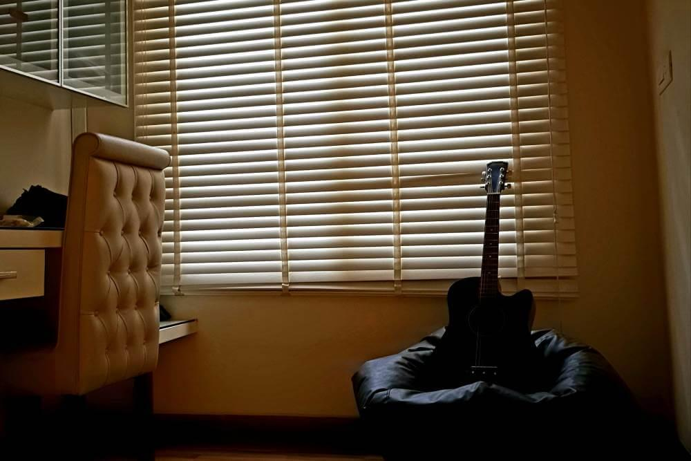
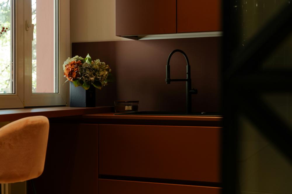
As we get into the paint color trends for 2023, moody brown is the unexpected star. Lauren Sullivan from Well x Design says saturated warm earth tones are making a big comeback, and moody brown is leading the way. This classic color is often overlooked but brings timeless elegance and comfort to any space.
The Comfort of Moody Brown
Moody brown is all about warmth and grounding. Unlike harsher colors, this rich color wraps a room in a comfort blanket, making it perfect for intimate spaces. Personally, I find brown can make me feel stable and secure, promoting a sense of self-care and well-being and creating a sense of home.
Best Use: Cozy Study or Bedroom
In a cozy study, moody brown can be the perfect backdrop for deep focus and creativity. Imagine dark wood furniture against walls painted in this color with soft lighting, creating a warm glow. This color works beautifully with rich textures like leather and wool, so it is perfect for a study where you want to retreat and concentrate.
In the bedroom, a moody brown can create a sense of relaxation and calm. It pairs well with neutral bedding and soft textiles as you unwind after a long day. I love the idea of using moody brown as an accent wall behind a bed, creating a beautiful focal point that feels warm and cozy.
A Neutral
One of the best things about moody brown is it’s neutral. It works with so many other colors and materials, so there are endless design options. Whether paired with soft creams, vibrant jewel tones, or other earthy colors, moody brown adds depth without overwhelming.
Pairing Options
If you want to use moody brown in your space, consider pairing it with light woods and metals for a balanced look. Pairing moody brown with a vibrant color like India Yellow can create a dynamic and balanced look. It can highlight the texture of natural materials and give your decor an organic feel. I love how moody brown can warm up cooler tones and create a harmonious palette that feels grounded and sophisticated.
The Psychology of Brown
Moody brown has benefits beyond its looks. Brown is often linked to stability, reliability, and comfort. These qualities are important in our homes as we seek refuge in our living spaces. For me, a room painted moody brown feels like not just a room but a sanctuary.

